Northbound
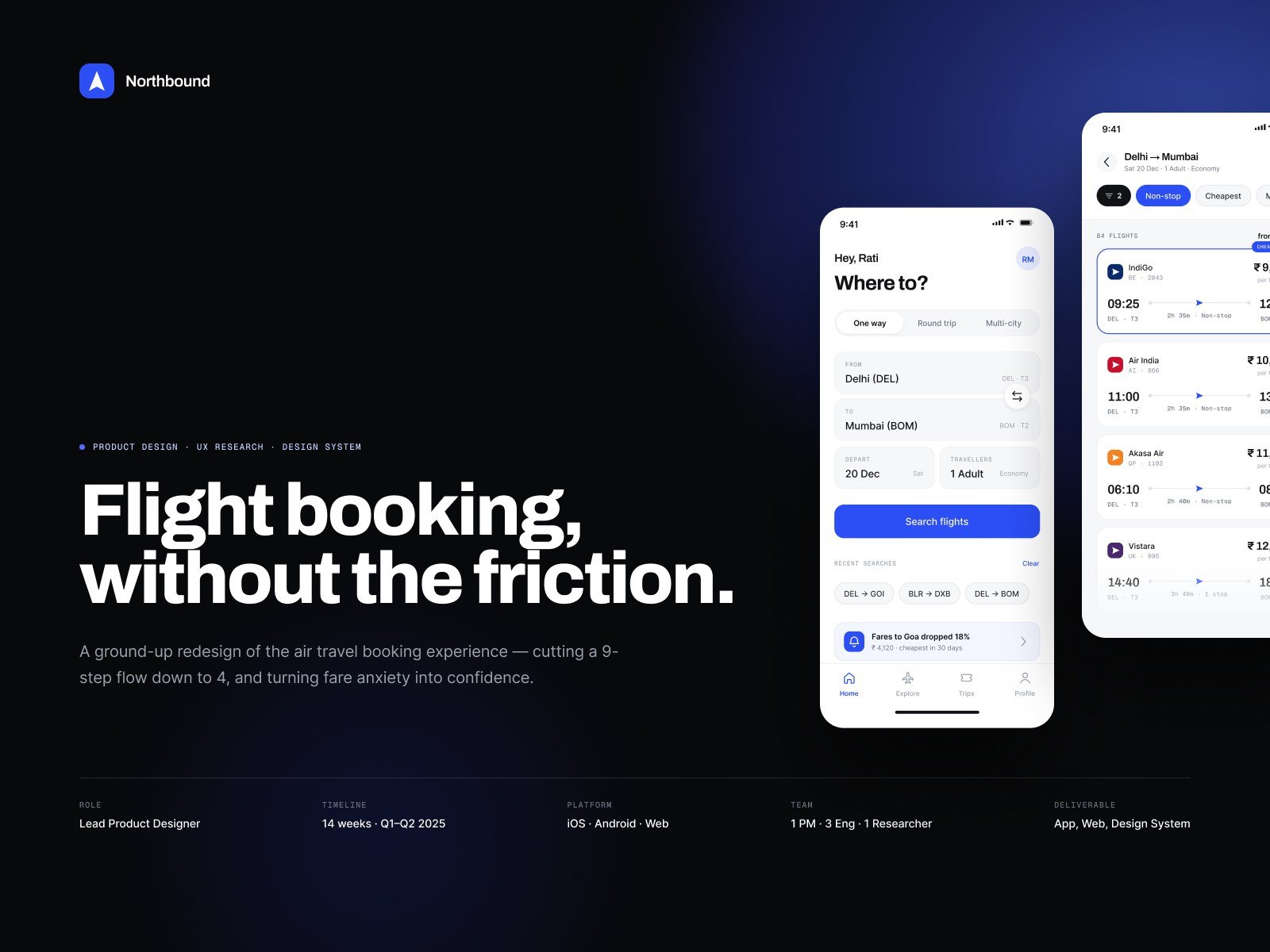
A ground-up redesign of the air travel booking experience — cutting a nine-step flow down to four, and turning fare anxiety into confidence.
The problem
Booking a flight had quietly become an endurance test. Nine screens stood between opening the app and a confirmed seat, and the price on the first screen was almost never the price at the end.
We audited eleven competitor flows and logged their real prices by hand in December 2025. Every one of them revealed the true total late — after seat selection, after baggage, after insurance had already been pre-ticked.
The brief was never to make the flow prettier. It was to make the number on the first screen the number you actually pay.
What we designed
Four screens: find, choose, confirm, done. Fare, bags and seat resolve in a single pass, and the running total updates on every tap instead of arriving as a surprise at checkout.
Personalisation stays optional. Seat selection can be skipped without penalty and nothing is pre-ticked. A token-driven design system keeps the same rules across iOS, Android and web, down to how a disabled fare reads to a screen reader.
Understanding the problem
Where a nine-step flow actually loses people, and what the brief had to fix.
Research
Interviews, a competitive price audit logged by hand, and the patterns that came out of both.
Structure
Rebuilding the architecture before drawing a single finished screen.
Identity & design system
A mark, a palette and a type scale, resolved into tokens and components.
The product
Find, choose, confirm — plus the states that decide whether any of it is usable.
Testing & outcome
Moderated rounds with twelve people, and an honest read of what actually moved.