Notch
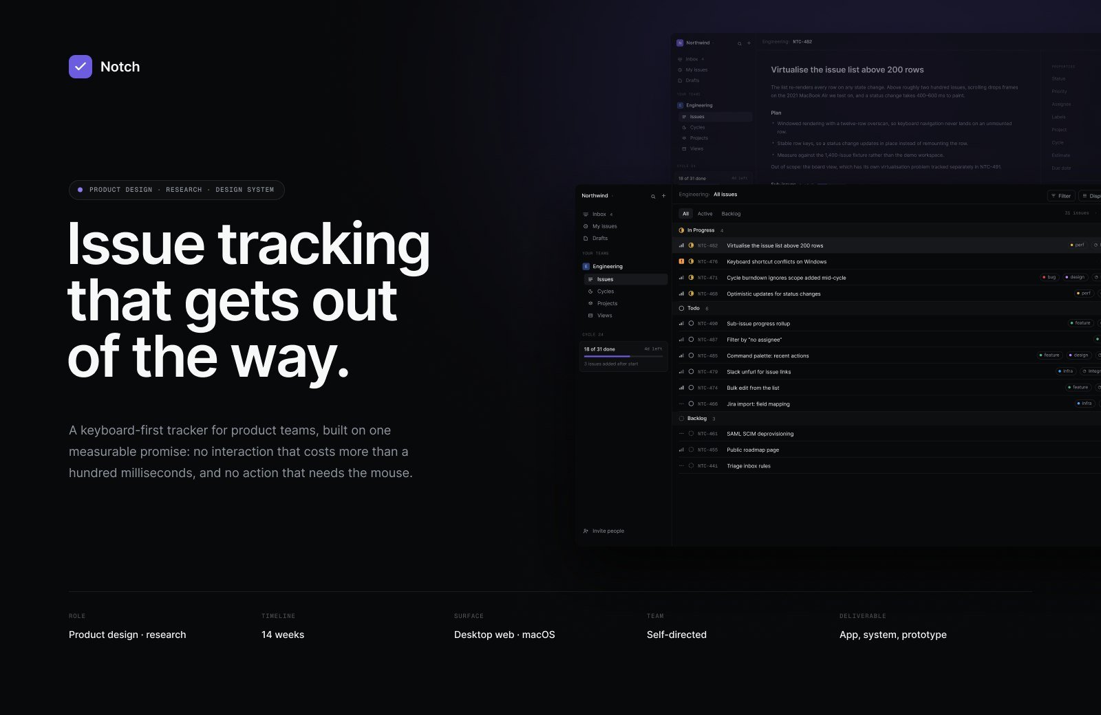
A keyboard-first tracker for product teams, built on one measurable promise: no interaction that costs more than a hundred milliseconds, and no action that needs the mouse.
The problem
Every tracker a product team touches was built for the person reporting work, not the person doing it. Filing an issue meant a modal, six fields and a mouse trip to a dropdown that could have been two keystrokes.
Speed was the whole thesis, so it had to be a constraint rather than an adjective. I set a hard budget on paper: no interaction over one hundred milliseconds, and every action reachable from the keyboard.
That budget shaped everything downstream — including a list that has to stay responsive above two hundred rows, where naive rendering drops frames on a 2021 MacBook Air.
What we designed
A command palette as the primary surface, a single-line filing bar, and a navigation model where every destination has a two-key path. The mouse remains supported and never required.
A density study in week nine changed the row height, the hit area and the slot order — all things the earlier screens had already assumed. Forty-two tokens and thirty-four components hold the result together across six screens.
The problem
What a tracker costs the person actually doing the work.
Research
Six teams, and the difference between how they file work and how they read it.
Interaction model
The keyboard map, the two-key rule, and the density study that rewrote the list.
Identity & design system
Forty-two tokens and thirty-four components, built to survive a dense dark interface.
The product
Six screens, and the states that carry the weight between them.
Outcome
Three rounds, nineteen people, one prototype.
What moved
What I would do differently
- 01
I designed the list before I measured it
The density study landed in week nine. It changed the row height, the hit area and the slot order — all things the earlier screens had already assumed. Measuring first would have saved a fortnight of redrawing.
- 02
Refusing custom fields costs somebody their job
Two of the six teams used a custom field for a genuine regulatory requirement. “No custom fields” is a good constraint for the product and a real problem for them, and I do not have an answer beyond saying so.
- 03
I never tested with a screen reader
Contrast, focus order and shape-not-colour were specified and checked with tooling. Nobody navigated this with VoiceOver, which means the accessibility board describes intent rather than evidence.